
Website Navigation Best Practices: Check GA4 and 301s Before Launch
Good website navigation keeps top-level links visible whenever screen space allows, uses short and specific labels, limits hierarchy to three levels or fewer with breadcrumbs for anything deeper, follows mobile-specific rules for hamburger menus, and ships basic accessibility patterns like semantic markup and visible focus states. Each of these rules breaks down into concrete checks you can apply to a live site this week, which is what the rest of this guide walks through.
TL;DR:
- Cap hierarchy at three levels, use unique labels of one to three words, prioritize key links, and add breadcrumbs from level three onward.
- On phones, keep two or three priority links visible once menus exceed four items, and make every touch target at least 44 by 44 pixels.
- Use simple dropdowns for short related lists and mega menus for large catalogs; avoid cascading flyouts, which are difficult on touchscreens and keyboards.
- Build menus with semantic navigation and lists, identify the active page with aria-current, label each navigation region, and show visible keyboard focus.
- Before launch, ask participants to find three to five common destinations, compare completion times, review click and search patterns, and check keyboard access and redirects.
Table of Contents
- Make navigation visible and put menus where users expect
- Write short, specific labels and order them by priority
- Hierarchy, depth limits, and breadcrumbs
- Menu types: dropdowns, mega menus, and utility menus
- Mobile and responsive navigation rules
- Accessibility and semantic markup you can ship today
- Interaction, visual, and micro-design details
- Testing, analytics, and a validation checklist
- How we prioritize navigation tradeoffs on client projects
- Let us rebuild your navigation the right way
- FAQ
- Sources
Make navigation visible and put menus where users expect
Visibility beats cleverness. Usability testing on hidden versus visible navigation found that hidden navigation reduces discoverability and raises task time, especially on desktop, where there is rarely a real reason to hide top-level links behind an icon. Desktop screens have the room, so use it.
Placement matters as much as visibility. Readers expect a horizontal bar across the top of a marketing site, a left-hand rail for complex applications with many sections, and a footer or utility bar for secondary items like login, help, or legal pages. Breaking from these conventions forces people to relearn your site instead of using what they already know from everywhere else on the web.
Hiding navigation is sometimes the right call, but it should be a deliberate tradeoff, not a default. The same NN/g research found that hiding navigation hurts discoverability less on mobile than on desktop, since small screens genuinely lack the space for a full horizontal bar.
Use this short checklist before you hide anything:
- Confirm the screen is actually too narrow for visible links before reaching for a hamburger icon.
- Try partial visibility first: show your top 3 to 5 links and tuck the rest behind a “more” option.
- Use progressive disclosure (expand on demand) instead of a fully collapsed menu when you have the space for even one row of links.
- Keep the most-used links, like search or cart, visible regardless of screen size.
Write short, specific labels and order them by priority
A label only works if a visitor understands it in under a second. Avoid internal jargon, department names, or abstract words like “Solutions” or “Resources” when a specific noun would do the job faster: “Pricing” beats “Plans,” and “Contact” beats “Get in Touch.”
Front-load the keyword that matters. If a link leads to a page about commercial lease agreements, “Commercial Leases” scans faster than “Services We Offer for Businesses.” Aim for one to three words per label, keep every label on the menu unique, and make sure no two links could plausibly lead to the same place.
Order carries meaning too. People remember the first and last items in a list more easily than the ones in the middle, a pattern worth using to your advantage by placing your highest-priority link first and a strong secondary option (often “Contact” or “Get Started”) last.
- Lead with the link that serves the most visitors or drives the most revenue.
- Group related items together rather than scattering them by alphabetical habit.
- Reserve the last position for a high-intent action like contact or purchase.
Pro Tip: Read your menu labels out loud. If you have to explain what one means, rewrite it.
Hierarchy, depth limits, and breadcrumbs
Keep your navigation to three levels deep at most. The W3C Web Accessibility Initiative recommends a maximum of three levels of hierarchy, with breadcrumbs added once a site reaches three levels or more, because deeper structures become difficult for visitors and assistive technology alike to track.
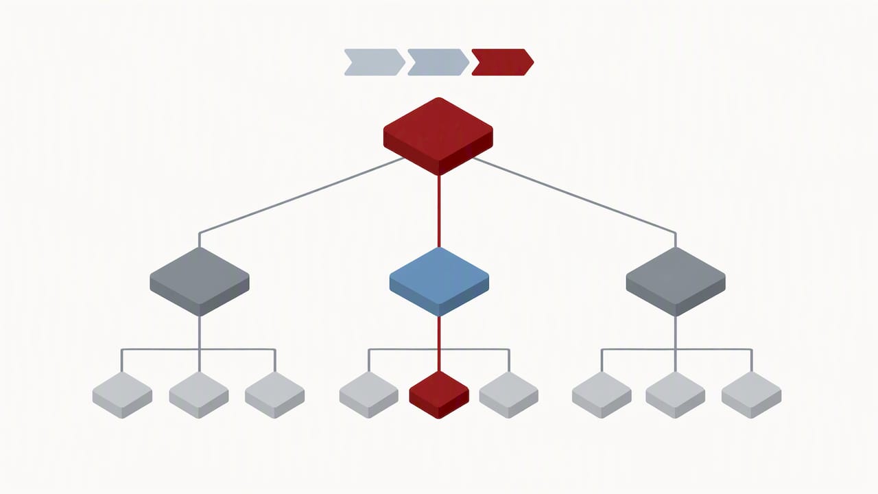
Breadcrumbs solve a specific problem: they tell someone where they are without forcing them to retrace every click. Place them at the top of the content area, just beneath your global navigation, so they read as a natural extension of “you are here” rather than a buried afterthought.
When a section naturally wants a fourth or fifth level, that is usually a sign you need a landing page instead of another nested menu tier. A landing page can group related subpages with its own internal links and short descriptions, flattening the structure while still helping visitors find specific content.
- Cap menu depth at three levels and route anything deeper through a landing page.
- Add breadcrumbs on every page at level three or beyond.
- Place breadcrumbs directly under the global navigation, not at the page’s footer.
- Review your sitemap periodically for pages requiring four or more clicks from the homepage.
Menu types: dropdowns, mega menus, and utility menus
Different structures call for different menu patterns, and picking the wrong one is one of the fastest ways to frustrate a visitor.
- Simple dropdowns work well for a short, flat list of related links, such as five or six service pages under one category; NN/g guidance notes that dropdowns suit a moderate number of options, while very short lists are better served by visible buttons and very long lists by a searchable combobox.
- Mega menus fit large catalogs or sites with dozens of subpages. NN/g notes that mega menus reduce the memory load of a large site by showing many options at once, as long as you use clear visual grouping, headers, and whitespace rather than letting the panel sprawl across the entire screen.
- Utility menus handle secondary tasks that do not belong in your primary navigation: login, account, language selection, or site search. Keep these visually distinct and usually positioned above or beside the main nav bar.
- Multi-level cascading flyouts, where a submenu opens another submenu, are worth avoiding in most cases. They demand precise mouse control, perform poorly on touch devices, and are difficult to navigate by keyboard. A mega menu or a dedicated landing page almost always handles the same content more reliably.
Matching the pattern to the content, rather than defaulting to whatever your framework ships with, is what separates navigation that feels effortless from navigation that fights the visitor at every click.
Mobile and responsive navigation rules
Phones change the math. If your top-level navigation has a few links, keep them visible in a bottom or top bar rather than tucking them behind an icon, a rule of thumb grounded in NN/g’s finding that hidden navigation costs less on mobile but still costs something. Once you have more than four, prioritize the two or three links visitors need most and move the rest behind a clearly labeled menu control.
A hamburger icon is not inherently bad, but it should never be the only way to reach commonly used destinations like search or cart. Progressive disclosure, showing a few links plus a “more” toggle, recovers much of the discoverability a fully hidden menu loses.
A few physical details matter as much as the structure itself:
- Keep touch targets at least 44 by 44 pixels so links do not trigger accidental taps.
- Use a sticky header for search or cart access on long pages.
- Offer a clear “back” or sequential path for multi-step flows instead of relying on the browser’s back button alone.
- Test every menu with one thumb on an actual phone, not just in a resized browser window.
Pro Tip: If you can fit your top links without an icon, skip the hamburger entirely; visible beats hidden every time screen space allows.
Accessibility and semantic markup you can ship today
Accessible navigation starts with plain HTML. Wrap your menu in a <nav> element containing an unordered list, add aria-current="page" to the active link, and give each navigation region a label with aria-label so assistive technology can distinguish a main menu from a footer menu, guidance drawn from the W3C’s menu structure tutorial.
For expandable items, reach for the Disclosure pattern rather than a full ARIA menubar. The W3C’s own menubar examples show how much keyboard handling a true menubar widget requires, complexity that a simple expand-and-collapse disclosure button avoids while covering nearly every common navigation case. On single-page applications, move keyboard focus to the new page’s heading after a navigation click, so a screen reader user gets clear confirmation that something changed.
Visible focus styles are not optional. A keyboard user who cannot see which link is focused cannot use your menu at all, regardless of how clean the markup underneath it is.
Cognitive accessibility deserves the same attention as screen-reader support. MDN’s guidance on cognitive accessibility emphasizes consistent visual indicators and predictable structure, which in practice means:
- Use the same label and icon for “expand” everywhere on the site, never mixing arrows, plus signs, and chevrons.
- Keep navigation in the same position on every page template.
- Never rely on hover alone to reveal a submenu, since it hides content from touch and keyboard users entirely.
- Mark the current page clearly, both visually and in the markup.
Interaction, visual, and micro-design details
Small specifications decide whether a menu feels solid or flimsy. Link text and icons need enough contrast against their background to read clearly, and icons should never stand in for text alone. A caret or hamburger glyph with no label forces every visitor to guess at its meaning.
Touch targets need real size. A minimum of 44 by 44 pixels, with enough padding between adjacent links, keeps a visitor on a phone from tapping “About” when they meant “Services.” Cramped navigation bars are one of the most common sources of accidental clicks on mobile.
Interaction pattern matters too. Click-activated submenus hold up far better across devices than hover-triggered ones, which break down entirely on touch screens and can trap keyboard users who tab past a menu that only opens on mouse movement. Pair a visible caret icon with any item that opens a submenu, so the affordance is obvious before anyone clicks.
- Maintain strong contrast between link text or icons and their background.
- Size tappable elements at 44 pixels or larger with adequate spacing.
- Activate submenus on click rather than hover for consistent behavior across devices.
- Keep your primary call-to-action button visually distinct from the rest of the navigation bar, not just another link in the row.
Testing, analytics, and a validation checklist
Treat navigation changes the way you would treat a product launch: measure before, change, then measure after. A short moderated usability test, even with five participants, can reveal whether people find a target page faster under the new structure, echoing the discoverability and task-time metrics NN/g uses to evaluate navigation.
- Run a quick discoverability test asking participants to find three to five common destinations, timing each attempt against your old navigation.
- Watch analytics for navigation click distribution, internal search usage, and pogo-sticking between pages, since a spike in any of these after launch usually signals a label or placement problem.
- Confirm keyboard focus order, mobile tap target sizes, and ARIA attributes in a manual QA pass before pushing live.
- Track GA4 events for menu opens and in-menu clicks, and verify every changed URL has a working 301 redirect so you do not lose existing search rankings, a process our website redesign checklist walks through step by step.
A navigation change that looks cleaner on a mockup but raises exit rates on your top landing pages is not an improvement, no matter how it tested internally.
How we prioritize navigation tradeoffs on client projects
We weigh discoverability, conversion goals, and existing analytics before touching a live menu, and we favor incremental changes over a full rebuild unless the data clearly calls for one. A visible top link, a dropdown, and a dedicated landing page all solve the same problem differently, so the choice comes down to how many options exist and how often visitors need them. When a client is unsure, we run a quick test and present the tradeoffs in plain numbers rather than opinions.
— Will
Let us rebuild your navigation the right way
Fixing navigation rarely means starting from scratch. Through our website development service, we audit your current menu structure against the checks in this guide, flag where labels, depth, or mobile behavior are costing you visitors, and rebuild the navigation as part of a broader site update, complete with redirect handling so you keep the search rankings you already earned.

If your menu has grown messier with every new page added over the years, a structured audit usually finds the fix faster than another internal redesign attempt — learn more about practical site structure for SEO. Reach out through our website development page to get a navigation review scoped for your site.
FAQ
What is the best practice for a website menu?
Keep top-level links visible whenever screen space allows, use short and specific labels, and limit your hierarchy to three levels or fewer. Add breadcrumbs for anything deeper, and follow the W3C’s guidance on maximum hierarchy depth to keep the structure usable for both visitors and screen readers.
What are the four rules for designing great navigation?
A strong navigation system stays visible rather than hidden where space allows, uses clear and consistent labels, limits depth with breadcrumbs for deeper sections, and follows accessible markup patterns like semantic nav elements and visible focus states. These four areas cover discoverability, clarity, structure, and usability for assistive technology.
What is the most common website navigation technique?
A horizontal top navigation bar is the most common pattern on marketing and content sites, usually paired with a hamburger menu or condensed link set on mobile. Dropdowns and mega menus extend this pattern for sites with more sections, following guidance like NN/g’s menu design checklist.
How do I design a website with effective navigation?
Start by limiting your menu to the highest-priority links, written as short and specific labels, then cap your hierarchy at three levels with breadcrumbs beyond that. Layer in accessible markup such as semantic lists and aria-current, and test the result with real users before and after launch to confirm it actually performs better.
Should I use a hamburger menu on mobile?
A hamburger menu is reasonable on mobile once you have more than about four top-level links, since NN/g’s research found hidden navigation costs less discoverability on mobile than on desktop. Keep your two or three most important links visible outside the hamburger icon whenever possible, rather than hiding everything behind it.