
Audit Your Top 5 Pages for WCAG AA: Website Accessibility Checklist
This is a practical, WCAG-aligned checklist you can use to audit critical pages right now: run an automated scan, then perform keyboard and screen-reader checks on your top five pages. Use it to catch obvious errors fast and to prioritize fixes by legal risk and user impact, targeting WCAG 2.1 Level AA as your baseline. Treat it as a repeatable audit tool, not a one-time project.
TL;DR:
- Most websites should aim for WCAG 2.1 Level AA conformance, especially for legal compliance and broader accessibility standards.
- Key fixes include establishing a logical heading hierarchy, adding skip links, and ensuring all images have meaningful alt text.
- Testing must combine automated scans, manual keyboard navigation, and screen reader walkthroughs to identify real-world issues.
- Addressing alt text, form labels, and keyboard focus issues remains the most efficient way to reduce legal risks and improve user experience.
- Building accessibility into the initial website design is more effective and often less costly than retrofitting a non-compliant site later.
Table of Contents
- WCAG Principles and What Conformance Level to Target
- Content and Text: Headings, Links, and ARIA That Actually Help
- Images and Icons: Getting Alt Text and Descriptions Right
- Links, Buttons, and Navigation People Can Actually Operate
- Forms, Inputs, and Custom Controls Worth Trusting
- Keyboard Access and Focus Order That Hold Up Under Testing
- Tables and Data: Keeping Structure Intact for Assistive Tech
- Media Accessibility: Captions, Transcripts, and Audio Descriptions
- Testing and Verification: Building a Workflow That Actually Catches Problems
- Making Accessibility Part of the Workflow, Not a One-Time Fix
- What Actually Moves the Needle: Priorities, Pitfalls, and Timelines
- Where to Get Help Building an Accessible Site From the Ground Up
- Where to Verify the Standards Yourself
- Sources
- FAQ
WCAG Principles and What Conformance Level to Target
Every item on a solid web accessibility checklist traces back to four principles: Perceivable, Operable, Understandable, and Robust, known together as POUR. Content is perceivable when people can sense it through sight, sound, or touch, whether that means alt text for images or captions for video. It’s operable when every function works via keyboard, mouse, or assistive device without traps or time limits that block completion. Understandable content uses predictable navigation and plain language. Robust code works reliably across browsers and assistive technologies, including screen readers that haven’t been built yet.
WCAG defines three conformance levels: A (minimum), AA (mid-range, and the standard nearly everyone should target), and AAA (the strictest, rarely required site-wide). Level AA is the practical target for most businesses and the level referenced most often in legal contexts.
That legal backdrop matters. The Department of Justice’s Title II rule requires public entities to meet WCAG 2.1 Level AA, with large public entities (population 50,000 or more) required to comply by April 24, 2026, and smaller entities by April 26, 2027. Private-sector lawsuits routinely cite WCAG 2.1 AA as the benchmark too, even without a specific statute naming it.
Before you start auditing:
- Confirm which WCAG version and level applies to your organization (AA is the safe default).
- Identify your five highest-traffic or highest-risk pages first.
- Decide whether you’re auditing for legal compliance, user experience, or both.
Content and Text: Headings, Links, and ARIA That Actually Help
Screen reader users navigate by heading structure far more than by scrolling, so a broken hierarchy is one of the most damaging accessibility gaps on a site. Fix the structural basics first, then layer in ARIA only where semantic HTML falls short.
- Build a logical heading hierarchy. One H1 per page, followed by H2s and H3s that nest in order, with no skipped levels just to change font size.
- Add skip links. A “Skip to main content” link at the top of the page lets keyboard users bypass repetitive navigation.
- Write link text that stands alone. “Read our pricing guide” tells a screen reader user something; “click here” tells them nothing.
- Use landmark roles.
<header>,<nav>,<main>, and<footer>(or their ARIA equivalents) let assistive tech users jump between page regions instantly. - Match heading hierarchy to visual layout. If a section looks like a subsection visually, it needs to be coded as one.
- Reserve ARIA for gaps native HTML can’t fill. ARIA roles and accessible names help when you’re building custom widgets, but adding
role="button"to an actual<button>element is redundant and can confuse assistive tech.
Since success criteria are technology-neutral, there’s no single “correct” way to hit these goals. Semantic HTML, ARIA attributes, and scripted enhancements can all satisfy the same criterion, so pick whatever fits your codebase instead of chasing a specific technique someone recommended online.
Pro Tip: Over-applying ARIA is nearly as damaging as skipping it entirely. If a native HTML element already does the job, adding ARIA on top of it just adds another point of failure.
Images and Icons: Getting Alt Text and Descriptions Right
Non-text content trips up more audits than almost anything else, mostly because teams either skip alt text entirely or write the same lazy description on every image.
The rules are simpler than they look:
- Meaningful images (product photos, informational graphics, headshots) need descriptive alt text that conveys what the image communicates, not just what it depicts.
- Purely decorative images (background textures, spacer graphics) need an empty
alt=""attribute so screen readers skip them instead of announcing “image, image, image” repeatedly. - Linked images need alt text describing the link’s destination, not just the picture itself. An image linking to your contact page should say “Contact us,” not “photo of phone.”
- Complex images like charts, infographics, or diagrams need a long description nearby, either as adjacent text, a linked transcript, or a data table that conveys the same information.
- Icon fonts and SVG sprites need accessible names through
aria-labelor visually hidden text, plus a visible label whenever the icon alone is ambiguous, like a hamburger menu or a trash-can delete button.
The test is simple: close your eyes, have someone read the alt text aloud, and ask whether you’d understand the page’s content and purpose. If the answer is no, the alt text needs work.
Links, Buttons, and Navigation People Can Actually Operate
Operability is where a lot of “accessible-looking” sites quietly fail, usually because focus and navigation never got tested by an actual keyboard user.
- Write descriptive link and button text. Ditch “click here,” “read more,” and “learn more” in favor of text that describes the destination or action on its own.
- Add visible focus indicators to every interactive element. A browser’s default focus outline is better than nothing, but a custom style that matches your brand and stays clearly visible against your background works better.
- Test for keyboard traps. Tab through the entire page. If focus ever gets stuck inside a widget, modal, or menu with no way out, that’s a hard failure, not a minor bug.
- Use landmark regions consistently so keyboard and screen reader users can jump straight to navigation, main content, or footer without tabbing through everything in between.
- Confirm skip-to-content links actually work. Test that clicking or activating the link moves focus, not just the visual scroll position.
- Check tab order against visual order. If your CSS reorders elements visually but the DOM order stays the same, keyboard users experience a confusing, illogical sequence.
None of this requires exotic tooling. A keyboard, a browser, and fifteen minutes per page catch most navigation failures before a single user ever files a complaint.
Forms, Inputs, and Custom Controls Worth Trusting
Forms are where accessibility failures turn into lost conversions, not just compliance gaps. A user who can’t figure out what a field wants, or can’t tell why their submission failed, leaves.
- Associate every label with its input programmatically, using
for/idpairs oraria-labelledby. Placeholder text is not a substitute for a real label; it disappears the moment someone starts typing. - Provide instructions before the user hits an error, not just after. If a password needs eight characters and a number, say so up front.
- Write error messages that identify the specific field and the specific problem, then suggest a fix. “Invalid input” tells the user nothing useful.
- Make sure error messages are announced to screen readers automatically, typically through
aria-liveregions, rather than relying on color or an icon alone. - Build custom widgets like date pickers, sliders, and dropdowns with full keyboard support and the appropriate ARIA pattern rather than a completely custom, unlabeled interaction model.
Pro Tip: Test every form by unplugging your mouse. If you can’t complete a purchase, a signup, or a contact request using only the keyboard, neither can a huge segment of your audience.
Keyboard Access and Focus Order That Hold Up Under Testing
Keyboard testing is the fastest, cheapest accessibility check available, and it’s the one most teams skip because it takes actual hands-on time rather than a scanner click.
- Tab through the entire page from top to bottom, confirming every interactive element (links, buttons, form fields, custom widgets) receives focus in a logical order.
- Use Shift+Tab to reverse direction and confirm focus moves backward the way you’d expect.
- Activate buttons and links with Enter and Space, since some custom components respond to only one of the two.
- Use arrow keys inside composite widgets like menus, tabs, and sliders to confirm they follow expected keyboard patterns.
- Watch for keyboard traps anywhere focus gets stuck inside a modal, embedded widget, or third-party script with no exit.
- Confirm focus styles are visible and high-contrast against every background color on the page, not just the default white background you tested first.
If any of these steps fail, that’s a priority fix, not a backlog item. Keyboard-only users and many screen reader users depend on this working every single time.
Tables and Data: Keeping Structure Intact for Assistive Tech
Data tables either communicate relationships clearly or turn into an unreadable wall of numbers for anyone using a screen reader.
- Use proper semantic markup:
<thead>,<tbody>, and<th>elements withscope="col"orscope="row"so assistive tech can announce which header applies to which cell. - Add a
<caption>for any table complex enough that a sighted user would need a title to understand it at a glance. - Never use tables for visual layout. That practice confuses screen readers, which announce layout tables as if they contain real data relationships.
- For responsive designs that stack table rows into cards on mobile, verify the header association survives the transformation. A visually appealing responsive table that loses its
scopeattributes defeats the purpose. - For unusually complex tables, provide a plain-language summary or an alternative format alongside the table itself.
Media Accessibility: Captions, Transcripts, and Audio Descriptions
Time-based media fails two distinct audiences at once when it’s built without accessibility in mind: people who are deaf or hard of hearing, and people who are blind or have low vision.
- Provide accurate, synchronized captions for every prerecorded video, not auto-generated captions left uncorrected. Auto-caption errors on names, jargon, and numbers are common enough to actively mislead viewers.
- Supply a full transcript for audio-only content like podcasts, since transcripts also make the content searchable and skimmable.
- Add audio description, a narrated track describing key visual information, whenever a video conveys meaning purely through images the soundtrack doesn’t explain.
- Confirm the video or audio player’s controls (play, pause, volume, captions toggle) are keyboard operable and carry accessible names, not just icon buttons with no label.
Media is one of the more resource-intensive parts of any web accessibility checklist, but it’s also one of the most legally scrutinized, since captioning failures are easy for auditors and plaintiffs’ attorneys to spot on a first pass.
Testing and Verification: Building a Workflow That Actually Catches Problems
Running a scanner and calling it done is the single most common accessibility mistake. Automated tools are fast and useful, but they only catch a fraction of real-world issues, since so much of accessibility depends on context a script can’t evaluate, like whether alt text is actually meaningful or a tab order actually makes sense.
- Start with an automated scan across your priority pages to catch obvious, mechanical errors: missing alt attributes, empty links, insufficient color contrast ratios, and missing form labels.
- Move to manual keyboard testing immediately after, since automated tools can’t tell you whether your tab order is logical or whether a keyboard trap exists.
- Run a screen reader pass using NVDA on Windows or VoiceOver on Mac, testing navigation, form completion, and media playback.
- Check cognitive load and readability, looking at sentence complexity, consistent navigation patterns, and whether error recovery makes sense to a first-time visitor.
- Define your evaluation scope using WCAG-EM, the W3C’s five-step methodology: define scope, explore the site structure, select a representative sample, evaluate that sample, and report findings.
- Pick a representative sample of pages, starting with your five highest-traffic or highest-conversion pages, then expanding outward to templates that repeat across the site.
A combined automated-and-manual approach exists precisely because neither method alone gets you to real conformance. Automated scanning alone tends to surface only a narrow slice of the issues a full manual audit would find, which is exactly why the WCAG-EM methodology insists on structured manual sampling rather than a scanner report by itself.
Making Accessibility Part of the Workflow, Not a One-Time Fix
Accessibility degrades fast without ownership. A site that passes an audit in January can fail by June if a new template, plugin, or content pattern gets shipped without a check.
- Assign a specific person or team as the accessibility owner, even if it’s a shared responsibility split across design and development.
- Set a remediation cadence, whether that’s monthly for high-traffic sites or quarterly for smaller ones, and track fixes through your normal version control workflow.
- Prioritize your five highest-impact pages for immediate remediation, then build a rolling schedule to work through the rest of the site systematically.
- Bake accessibility checks into QA sign-off, CMS page templates, and content authoring guidelines so new pages don’t reintroduce old problems.
- Schedule periodic testing with real assistive technology users when the budget allows; automated and manual expert review both miss things that only lived experience catches.
Building these checks into a CI/CD pipeline, where feasible, catches regressions before they ship rather than months later during the next audit cycle.
What Actually Moves the Needle: Priorities, Pitfalls, and Timelines
If you fix nothing else, fix alt text, form labels, and keyboard navigation first. Those three categories account for a disproportionate share of both lawsuits and real user frustration, and they’re usually cheap to remediate compared to a full color contrast overhaul or a video captioning backlog.
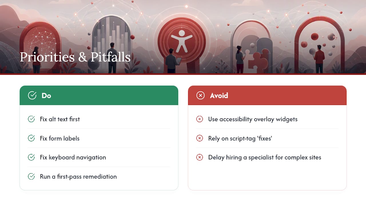
Skip the accessibility overlay widgets that promise instant compliance through a script tag. They frequently break keyboard navigation, conflict with existing ARIA markup, and have drawn their own wave of lawsuits for failing to deliver the compliance they advertise.
For timelines: a small business site with under 20 pages can usually get through a first-pass remediation in two to four weeks with a competent developer. Larger sites with custom components, e-commerce checkouts, or extensive media libraries often need three to six months, and that’s usually the point where bringing in a specialist earns back its cost through avoided rework.
— Will
Where to Get Help Building an Accessible Site From the Ground Up
Retrofitting an old site for accessibility is almost always harder than building one correctly from the start. Some agencies build custom websites with accessibility considered from the first wireframe, not bolted on after launch as a compliance patch, which is where most overlay-widget shortcuts fail.

If your current site failed half the checklist above, you have two real options: hand a developer a punch list and hope every fix gets tested properly, or work with a team that builds accessible structure into the site from the start. Dotxero’s website development service covers custom builds for Las Vegas businesses across law, retail, contracting, and jewelry, with mobile-first design and technical audits built into the process rather than tacked on afterward. A remediation engagement typically starts with an audit of your priority pages, followed by a fix schedule tied to real launch dates, not a vague promise to “get to it eventually.” If your last redesign skipped accessibility entirely, get in touch through Dotxero and ask what a realistic remediation timeline looks like for your site.
Where to Verify the Standards Yourself
For the normative success criteria behind every item above, go straight to W3C’s Understanding WCAG 2.2 documentation. For structuring a formal evaluation, the WCAG-EM methodology walks through scoping and sampling. For the legal deadlines affecting public entities, read the DOJ’s Title II web rule directly rather than relying on a summary.
FAQ
What Are the 4 Principles of Web Accessibility?
The four principles, known as POUR, are Perceivable, Operable, Understandable, and Robust. Every WCAG success criterion falls under one of these four categories, which is why they form the backbone of any web accessibility checklist.
How Do You Check if a Website Is Accessible?
Start with an automated scanning tool to catch obvious errors like missing alt text or low color contrast, then follow up with manual keyboard navigation and a screen reader pass using NVDA or VoiceOver. Automated tools alone miss a large share of real issues, so manual testing on your top pages is not optional if you want an accurate picture.
How Can I Make Sure My Website Is Accessible?
Work through a structured checklist covering headings, alt text, forms, keyboard navigation, and media captions, then test with real assistive technology rather than assumptions. If your team lacks the bandwidth, an agency like Dotxero can handle a website development project with accessibility built into the design and code from the start.
What Are the 4 Guidelines of WCAG?
WCAG is organized around the four POUR principles, each broken into specific guidelines and testable success criteria at levels A, AA, and AAA. Most organizations should target Level AA, which is also the standard referenced in the DOJ’s Title II web rule for public entities.
How Much Does It Cost to Fix Website Accessibility Issues?
Cost depends heavily on site size, how many custom components need remediation, and whether you’re fixing an existing site or building new. Dotxero’s website development pricing is available on request based on project scope.