
5–8 Metrics for Marketing Dashboards Marketers Can Copy, by Role
A marketing dashboard should answer one question fast: is revenue moving in the right direction, and why? The strongest dashboards lead with revenue-linked KPIs (ROMI, CAC, LTV:CAC), pair them with a pipeline leading indicator, and add a handful of channel diagnostics, capped at 5 to 8 metrics per view with trend lines and variance to plan. Done right, this setup speeds up decisions, clarifies attribution, and flags problems before they hit revenue. Here’s how to build it by domain, by role, and by governance rule.
TL;DR:
- Prioritize five to eight core metrics, including revenue-linked KPIs like ROMI, CAC, and LTV:CAC, with trend lines and threshold-based alerts to guide decisions.
- Build role-specific dashboards with relevant metrics for executives, managers, and channel leads, avoiding unnecessary data to maintain clarity and actionability.
- Ensure data collection and integration are trustworthy by assigning clear ownership, aligning attribution windows, and scheduling regular quality checks across all systems.
- Pair lagging indicators like revenue with leading metrics such as pipeline coverage to enable proactive management and timely interventions.
- Limit dashboards to decision-oriented metrics with preset alert thresholds, and use automation to keep data current, avoiding information overload and boosting adoption.
Table of Contents
- Which Marketing Dashboard Metrics Matter Most?
- What Should a Dashboard Look Like for Each Marketing Role?
- How Should You Design a Dashboard for Readability?
- Where Do Dashboard Numbers Actually Come From?
- How Do You Pair Leading and Lagging Indicators?
- Who Owns the Dashboard and How Often Should It Refresh?
- What Does an Agency Checklist Look Like for Small-Business Dashboards?
- What the Research Actually Supports
- Building the Dashboard Without Building It Yourself
- Sources
- FAQ
Which Marketing Dashboard Metrics Matter Most?
Not every number deserves a spot on the dashboard. A KPI is a small, decision-focused measure tied to budget or strategy calls; everything else is a diagnostic that belongs in a drilldown, not the headline view, according to Swydo’s breakdown of KPIs versus metrics. Marketers are already shifting this way: teams are prioritizing lead quality, conversion rates, ROMI, and CAC over surface engagement numbers like impressions or follower counts, per HubSpot’s 2026 research on marketing performance.

Group your candidates by domain before deciding what makes the cut.
Revenue and profitability
- ROMI (return on marketing investment): (revenue attributed to marketing minus marketing cost) divided by marketing cost. Review monthly. Trigger: a sustained drop signals it’s time to audit channel mix, not just spend more.
- CAC (customer acquisition cost): total marketing and sales spend divided by new customers acquired. Trigger: rising CAC without rising deal size means tighten targeting.
- LTV:CAC ratio: lifetime value divided by acquisition cost. A ratio under 3:1 usually means you’re paying too much for customers who don’t stick around.
- CAC payback period: months needed for gross margin from a customer to cover acquisition cost. Useful for deciding when to scale spend versus hold.
Pipeline and demand
- Marketing-sourced pipeline: dollar value of opportunities marketing generated, tracked weekly by sales ops.
- Pipeline coverage: pipeline value divided by revenue target for the period. Below 3x usually means the quota is at risk.
- Lead-to-opportunity conversion and SQL rate: how many raw leads survive qualification. A falling SQL rate often points to a lead-quality problem upstream, not a sales problem downstream.
Channel performance
- ROAS, CTR, conversion rate, CPC/CPL: the core paid-channel set, reviewed weekly against benchmarks that vary heavily by industry, as Klaviyo’s dashboard guide notes.
- Email revenue per recipient: total campaign revenue divided by list size sent. This one metric beats open rate for tying email directly to money.
Brand and visibility
- Branded search lift and share of voice: leading indicators of demand before it shows up in pipeline.
- AI/assistant visibility: how often your brand surfaces in AI-generated answers, an emerging diagnostic tier some 2026 frameworks now recommend tracking alongside branded search, according to MarqOps’s marketing KPI research.
Operations and efficiency
- Cost per lead, lead velocity, funnel conversion rates, churn/retention: these round out the operational view and usually live on a weekly ops dashboard rather than the executive summary.
What Should a Dashboard Look Like for Each Marketing Role?
Different roles need different slices of the same data. Here’s how to build role-specific views without duplicating work across five separate dashboards.
- CMO or executive view. Five to seven headline KPIs: revenue growth, ROMI, CAC, LTV:CAC, and marketing’s percentage contribution to total revenue, reviewed weekly or monthly. A CEO-level framework from Klipfolio recommends organizing these across financial, customer, people, and operations domains so leadership sees the full picture, not just spend. Decision example: if marketing’s revenue contribution drops two months running, that’s the trigger to reallocate budget toward the highest-ROMI channel.
- Digital or ops manager. A weekly operating view: pipeline coverage, top-of-funnel conversion, cost per lead, and channel ROAS side by side. Decision example: cost per lead spikes 20% while ROAS holds steady, meaning the market got more expensive, not less efficient.
- Paid media lead. CPC and CPL for cost, ROAS for efficiency, and conversion rate at the primary funnel step. Decision example: CTR climbs but conversion rate falls, pointing to a landing-page mismatch, not a targeting problem.
- Email marketer. Revenue per recipient, CTR, conversion rate, and list health (unsubscribe rate, bounce rate), with revenue attributed back through the email campaign management pipeline. Decision example: rising unsubscribes during a send-frequency increase means pull back cadence before revenue per recipient erodes.
- SEO or content lead. Nonbrand organic sessions, organic conversion rate, keyword ranking clusters, and assisted conversions. Decision example: rankings hold steady but organic conversion rate drops, which usually means the content is attracting the wrong intent.
How Should You Design a Dashboard for Readability?
Cap the summary view at 5 to 8 metrics, each shown with a 12 month sparkline, current value, variance to plan, and variance to the prior period. That display standard, backed by ClearPoint Strategy’s KPI dashboard research, is what separates a dashboard people actually open from one they ignore after week two.
Push everything else into drilldowns. If your summary view shows fifteen metrics, you’ve built a report, not a dashboard. And if every tile glows green, that’s not good news. It usually means your thresholds are set too loose to ever trigger action.
Match the visual format to the audience:
- Executive view: KPI cards with small sparklines, nothing dense.
- Channel comparison: compact tables, side by side, sortable.
- Monthly deep dive: full trend charts with annotations for campaign launches or budget shifts.
Every tile needs visible metadata: the metric’s definition, its data owner, its source system, and a last-refresh timestamp. Without that footer, nobody trusts the number when it looks off.
Pro Tip: Set preset alert thresholds tied to specific actions, not just color changes. A red tile that doesn’t trigger an email to the metric owner is decoration, not a warning system.
Where Do Dashboard Numbers Actually Come From?
Every KPI has a home system, and mixing them up is where dashboards quietly break. Pipeline figures come from the CRM. Sessions and conversion rate come from web analytics. Spend and CPC come from ad platforms. Opens, clicks, and email revenue come from the email platform. Revenue and LTV come from billing.
The integration work that actually matters:
- Assign one canonical data owner per metric, so nobody argues over whose number is “correct.”
- Align attribution windows across platforms. A 7-day click window in your ad platform won’t match a 30-day CRM window, and that mismatch alone causes half the “why don’t these numbers match” meetings.
- Unify currency and time zone settings before combining data across tools.
- Schedule refresh windows so stale data doesn’t get treated as current.
Run a quality checklist weekly: reconcile sample totals against source systems, document every metric’s formula in a shared dictionary, and surface a data-lag stamp on anything not refreshed in real time. A founder’s guide to compact analytics displays makes a similar point in a different context: dense progress indicators only work when the underlying data refresh is trustworthy, not just visually clean.
How Do You Pair Leading and Lagging Indicators?
Revenue is a lagging indicator. It tells you what already happened. Pipeline coverage or qualified website sessions are leading indicators. They tell you what’s about to happen. A dashboard built only on lagging metrics gives you a eulogy, not a warning.
- Pair every lagging KPI with one leading companion. Revenue pairs with pipeline coverage. CAC pairs with cost per lead. LTV pairs with retention rate.
- Set a rule of thumb threshold for each pair, drawn from the practice of pairing indicators like revenue and pipeline coverage described by research on leading versus lagging indicators.
- Attach a specific action to the trigger. Pipeline coverage under 3x for two straight weeks means demand-gen increases spend by a set percentage and reports weekly until coverage recovers, an approach Klipfolio’s metrics framework recommends formalizing in advance rather than deciding in the moment.
- Name an owner for every alert. A threshold with no owner just sits there blinking.
Who Owns the Dashboard and How Often Should It Refresh?
Refresh cadence should match who’s looking. Executives need weekly or monthly updates; ops and channel managers need daily or weekly views; strategy reviews belong on a quarterly calendar.
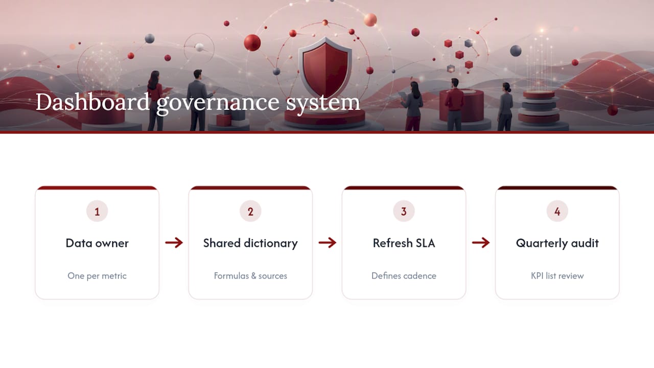
Governance keeps the whole system honest: name a data owner for every metric, keep formulas and sources in a shared dictionary, set a service-level agreement for refresh timing, and audit the full KPI list every quarter. Consistency matters more than most teams assume. Dashboards get read more often when they land in the same inbox at the same time every week, in a format that doesn’t change for at least a quarter, based on findings on dashboard adoption from The Pragmatic CFO.
Start with five trusted KPIs. Add diagnostics only once automation is reliable enough that nobody’s manually checking numbers. Retire metrics nobody has acted on in two quarters.
What Does an Agency Checklist Look Like for Small-Business Dashboards?
An agency has built marketing programs for businesses since 2007, across services including website development, SEO, Google Ads, social advertising, and email marketing. Building a dashboard for a small business usually starts with a data audit: what’s in the CRM, what the ad platforms report, what billing already tracks.
The checklist that tends to work: map every channel metric back to a business KPI first, request access to CRM and billing exports before touching ad platforms, and build the smallest useful KPI stack (usually 5 to 6 metrics) before adding anything else. Small businesses rarely need fifteen tiles. They need the three or four numbers that actually predict next quarter’s revenue, displayed the same way every week.
What the Research Actually Supports
Most advice on marketing dashboards focuses on tools and integrations. That’s the easy part. The harder problem, and the one that gets skipped, is deciding what earns a spot on the summary view in the first place.
Conventional wisdom says more visibility is always better. It isn’t. A dashboard with eighteen metrics and no thresholds is worse than one with five metrics that actually trigger action, because the eighteen-metric version trains people to skim past all of it. The research on adoption backs this up: consistency and restraint, not comprehensiveness, keep a dashboard in weekly rotation.
If you’re building one from scratch, prioritize in this order: pick your one or two revenue-linked lagging KPIs first, attach a leading companion to each, then add channel diagnostics only where they change a specific decision. Role-specific stacks matter more than a single master dashboard everyone squints at differently. A CMO and a paid media manager should never be staring at the same screen expecting it to answer two different questions.
— Will
Building the Dashboard Without Building It Yourself
Some agencies provide alternatives to hiring a full-time analyst or piecing together five disconnected tools for your marketing dashboard metrics. When an agency manages the channels feeding your data—ad platforms, email campaigns, SEO tracking—the dashboard build starts with data that’s already clean instead of a scramble to reconcile five exports.

Dot Xero’s website development work includes the data-layer instrumentation that feeds accurate session and conversion numbers into your dashboard from day one. Pair that with ongoing SEO, Google Ads management, or social media advertising, and the reporting comes from the same team running the campaigns, not a third party guessing at attribution. Deliverables typically include the data connections, KPI selection and design, the dashboard build itself, a metric dictionary for documentation, and ongoing reporting so the numbers stay trustworthy quarter over quarter. If your current setup means checking four different logins to answer one revenue question, consider reaching out to an agency to get a plan for a dashboard built around metrics that actually inform your next decision.
Sources
- KPI vs metric — Swydo
- How successful marketing teams are optimizing performance in 2026 — HubSpot
- The CEO’s guide to metrics that matter — Klipfolio
FAQ
What Are Metrics in a Dashboard?
Metrics are the individual measurements tracked over time, like sessions, clicks, or revenue. Only a small subset of those metrics, the ones tied directly to decisions, should be promoted to KPI status on the headline view.
What Should a Marketing Dashboard Include?
A strong dashboard includes 5 to 8 headline KPIs covering revenue (ROMI, CAC), pipeline (coverage, conversion rate), and one or two channel diagnostics, each shown with a trend sparkline and variance to plan.
What Are Some Good Marketing KPIs to Track?
ROMI, CAC, LTV:CAC ratio, pipeline coverage, and channel ROAS consistently rank as the metrics that tie most directly to revenue decisions rather than just activity.
How Often Should a Marketing Dashboard Refresh?
Executive dashboards typically refresh weekly or monthly, while operational and channel dashboards refresh daily or weekly to support faster tactical decisions.
Can an Agency Build a Custom Marketing Dashboard?
Yes. Some agencies build dashboards as part of their website development, SEO, Google Ads, social advertising, and email marketing services, mapping each channel’s data back to the client’s core revenue KPIs.